Vocabulary › Style idioms
Style idioms
A style name is a shorthand for a set of decisions about material, line and contrast. Naming those decisions makes the term usable as a condition and, more importantly, makes it checkable in the picture that comes back.
Why idioms need translating
Style names are compressions. Handed to an image model unaccompanied, a name such as minimal produces whatever that word happened to co-occur with, which is often a specific photographic look rather than a set of material decisions. Unpacking the name into material, line and contrast gives the model something it can act on and gives you something you can check.
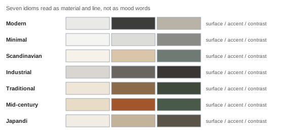
Seven idioms
| Idiom | In one line | What that means in materials |
|---|---|---|
| Modern | Flat planes, visible structure, low ornament. | Matt neutral walls, one strong dark, timber or stone left plain. Lines are straight and joints are expressed rather than hidden. Pattern appears once, if at all. |
| Minimal | Reduction of the number of visible objects, not of comfort. | A narrow value range, almost no contrast, storage that closes. The idiom is defined by what has been removed from view, so it fails immediately in a room that has to hold a lot. |
| Scandinavian | Pale timber, soft daylight, textiles doing the warming. | Light floors, off-white walls, wool and linen in muted colour, black used sparingly as a line. It reads as bright rather than cold because the textiles carry the warmth. |
| Industrial | Structural materials left as finishes. | Brick, concrete, steel and dark timber, with fittings that show their fixings. Contrast is high and surfaces are hard, so acoustics become a real constraint rather than a stylistic one. |
| Traditional | Layered pattern, framed edges, symmetrical arrangement. | Deeper colours, panelled or papered walls, patterned textiles in more than one scale, and furniture with turned or carved edges. Symmetry does most of the ordering work. |
| Mid-century | Tapered legs, warm timber, saturated accent colour. | Furniture lifted clear of the floor on thin legs, walnut or teak tones, and one or two saturated accents against otherwise quiet walls. Rooms read as lighter because so much floor stays visible. |
| Japandi | Low contrast, natural fibre, deliberate emptiness. | Paper, plaster, unfinished timber and a very narrow palette, with low furniture and long unbroken surfaces. It is the hardest idiom to render convincingly, because its effect depends on emptiness that a model tends to fill. |
Mixing and failing
Two idioms in one room usually works only when they share either a palette or a line. Mid-century and Scandinavian mix easily because both keep furniture light and floors visible; industrial and Japandi rarely do, because one is built on hard contrast and the other on its absence. When a render mixes idioms badly, the symptom is a room that reads as two photographs joined at the middle.